In praise of the printed word (and the typeface that makes it look so good).
It seems reports of the imminent death of print books was premature. Readers, in fact, appear to be rediscovering the aesthetic pleasure of bound volumes. Indie-bookstore sales are up, and legacy publishers are increasingly optimistic. Physical books — that combination of cover art, typography, trimmed or deckle-edge paper, heft — still have considerable appeal.
Penguin has had some fun with its Drop Cap classics — a “collectible” set of 26 books, an author for each letter of the alphabet, in rainbow hues with the covers designed by Jessica Hische.
The series, which debuted in 2012, has won design awards, but it is not luxurious. There is no jacket, no heavyweight or acid-free paper, no leather binding. In fact, they are more reminiscent of older series like the Grosset & Dunlap books. But they are attractive and give readers another chance to get hardback editions of books ranging from Jane Austen’s Pride and Prejudice to Carlos Ruiz Zafon’s The Shadow of the Wind.
Other collectible series continue to crank out volumes. The fancier and pricier Library of America series, with its sober black jackets, is coming out at an average one to two volumes a month. The books are made to last with acid-free paper and sewn bindings; a note at the end provides details on the typeface and cloth binding. The series, which now runs to more than 250 volumes, was originally modeled on the elegant Pléiade editions of French classics.
For most readers, it is not the series but the individual books that get their attention. Here, too, publishers are paying more attention to physical details. Alix Christie’s 2014 historical novel, Gutenberg’s Apprentice, depicts the excruciating trial and error in casting the letters for the first printing press.
Christie herself is a letterpress printer, and publisher HarperCollins took pains with the jacket, binding, typography, and design of the book to celebrate the printer’s art — including two types of drop caps throughout the novel.
This abiding aesthetic appeal was no doubt one of the reasons Amazon has been working hard to find a typeface suitable for its Kindles. The company last month introduced its new “Bookerly” typeface as the default font for its e-books. Amazon described it as a “hand-crafted” custom reading typeface created especially for Kindle for readability and reducing eyestrain across various devices.
Amazon says it is a “Humanist-inspired face,” and Fast Company describes it as the love child of the 225-year-old Baskerville and Caecilia, the previous default font on Kindle, largely remedying the problems of both. Fast Company also praises Kindle’s all-new layout engine that has “better text justification, kerning, drop caps, image positioning and more.”
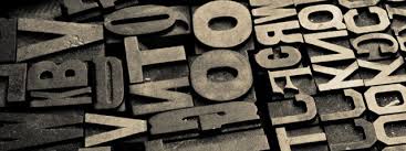
Fonts and glyphs and serifs may seem like terribly esoteric subjects, but these nuances of the printer’s art have a profound effect on our reading experience. The new Bookerly font, like the development of “Paperwhite” before it, shows that print remains the point of reference for e-books, too. Unsung artists work hard to adapt the classic typefaces from the Gutenberg era to modern technology and uses.
The New York Times this week marked the death of legendary typeface designer Hermann Zapf with a long, sensitive obituary, drawing attention to his creation of well-known fonts like Palatino and Optima, as well as the famous Zapf Dingbats. The article quoted Matthew Carter, the genius-grant recipient who designed Verdana and Georgia (as well as the Galliard face used in the LOA series), about the challenge of expressing creativity while being circumscribed by practicality.
“Zapf’s ability to find originality in his faces while not going outside the acceptable canon of legibility is really a triumph,” Carter told the Times.
Print, far from being dead, seems likely to continue setting the standard as long as the written word is used for communication.
Darrell Delamaide is the author of Gold and The Grand Mirage.