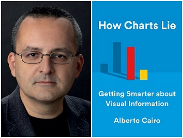
The designer/professor explains why it takes some savvy to read charts accurately.

In How Charts Lie: Getting Smarter about Visual Information, Alberto Cairo, a journalist, designer, and professor of visualization and infographics at the University of Miami, writes about how visuals are used both to express ideas and to mislead. The author holds nothing back while showing us how to read charts — whether in science, politics, or health — so we don’t get swindled.
In your book, you share a lot of stories from politics. Can you be political but nonpartisan?
To be political means that you care about public conversations about relevant topics, and I think that charts play a key role in those conversations. Most good charts are political, in this sense. Being partisan is different: It means that you somehow let your own views get in the way of a fair understanding of the information that the chart presents.
I deal with a lot of touchy issues like abortion and race in How Charts Lie. In the book, I discuss a terribly misleading chart used in Congress to attack Planned Parenthood. I don’t care what you think about that organization or about abortion in general. I do care, though, about the charts used in conversations about them. You can attack or defend Planned Parenthood — just use well-designed charts! One thing I cannot stand is propagandists. I like information and dislike propaganda.
Where should we start our discussion of charts?
Florence Nightingale designed several marvelous graphics that are landmarks in the history of visual communication, and that I praise in How Charts Lie. She used her graphics effectively not only to inform, but also to persuade. And Dr. John Snow and his cholera map from the 19th century proved a critical connection between tainted water and cholera at a time when people thought it was stinky air that transmitted cholera.
Are today’s charts different from older ones?
Charts and other visuals are often used nowadays to engage and get clicks, often at the expense of informing. We do need to strive to find the right balance of engagement, clarity, and depth. Charts should bring your reader in and provide them with information without oversimplifying.
Will the public eventually become more educated consumers of visual information?
Yes. In How Charts Lie, I describe a survey conducted by the Pew Research Center a few years ago. One question was about how to read a scatter plot, a common graphic form in visualization. This particular graphic showed that there’s a positive association between sugar consumption per capita and country and the amount of tooth decay. Around two-thirds of people in the survey could read the scatter plot. The other one-third couldn’t. My guess is that if we could have conducted a similar survey 20 years ago, the percentage who could read that type of graphic would have been lower. Scatter plots aren’t uncommon in news media nowadays, and people have learned to read them, so there is progress.
People don’t see what you design; they see what they see. How do people develop insight into their own biases?
When you start learning about human biases, you start becoming adept at identifying those biases in other people, but not in yourself. That’s a problem. Most of the examples in How Charts Lie aren’t graphics that I think were designed to deceive on purpose. They are examples of readers seeing what they want to see in the charts they find, or of designers plotting just what they want to see.
Can you create valid charts when there are areas of uncertainty?
Sure, but you need to show that uncertainty whenever possible and explain what [it] means. In How Charts Lie, and also in this piece I wrote for the New York Times, I describe how common people — that includes me! — often misinterpret the famous “cone of uncertainty” that the National Hurricane Center uses to show forecasts of where a hurricane may go. The misinterpretations aren’t due to the visual itself, I think, or to the information it contains. The problem is that it’s a complex chart that requires some explaining if you want people to grasp what it means. That’s why I’m an advocate for pairing charts with words, either written or spoken, particularly in cases like this.
What are you working on now?
I have a contract for my next book, aimed at designers and people who do graphics. It will focus on ethical thinking and reasoning. I want people to embrace graphics and break down the fear of creating visuals. Graphics deserve a position next to writing and speaking. Visuals can be as powerful and intellectually valid as written or spoken language.
[Editor's note: Click here to watch video of the unabridged interview.]
Tyler Cymet, DO, is the chief of Clinical Education at the American Association of Colleges of Osteopathic Medicine. He is currently a Change Management Consultant with Michigan State University and a clinical professor at the New York Institute of Technology.

